What is Responsive? A Brief Summary
Written by Sean Lamberger
onThursday, February 11th, 2016
in Design
Future-Proofing the Web for Screens of All Shapes and Sizes
Hey there! I’m Sean, GravityFree’s Art Director, and I’m here to give you a quick rundown of responsive web design and, more specifically, resolution-dependent breakpoints. If that all sounds scary and intimidating, don’t worry. Not only does this represent an exciting new tool in the web’s rich, deep bag of tricks, but it also couldn’t be much simpler.
Just ten years ago, designing for the web was a wildly different job than it is today. Sure, we had the stifling drawbacks of legacy browsers to deal with (Internet Explorer, I’m looking at you here) but with very few exceptions, the work was relatively straightforward. The canvas of the web was considered a fixed thing: we’d just design for the average monitor dimensions, dust off our hands and call it a day. Then, in 2007, a little device called the iPhone dropped into our laps and the smartphone revolution followed nearly overnight. Early promotional materials boasted that Apple’s new product would give its users the whole web, unrestrained by the limitations seen in other phones’ ugly, clunky text-only browsers. And as their devices grew to widespread acceptance, drawing fast competition from Google and Microsoft, the truth soon came to light: mobile browsers demand a mobile-optimized experience.
Shortly thereafter, the mainstream debut of tablet computers added another dimension to the mix. Quickly, it became apparent that the web’s days of sharing content through a firm, fixed window frame were already behind it. Enter responsive web design. That’s a buzzword (coined by Ethan Marcotte in this influential article) that you’ve probably heard a lot over the past several years, and it means precisely what it says: sites that conform to any screen, even those that have yet to be unleashed upon the world. Now that we’re living amongst the internet of things, there’s really no telling where your visitors are checking in from: a phone, their home PC, a smart watch, their Xbox, even an internet-enabled refrigerator. And that midnight snacker expects just as whole a browsing experience as anyone else.
So here’s the answer: smart, adaptive designs that can shuffle their contents and selectively hide or reveal components when the situation calls for it. Sites that can serve a tailor-made experience for every resolution, even when manufacturers decide to change the playing field with yet another unique screen size. Your website is already prepared for the iPhone 7S+, The Galaxy S8 and beyond.
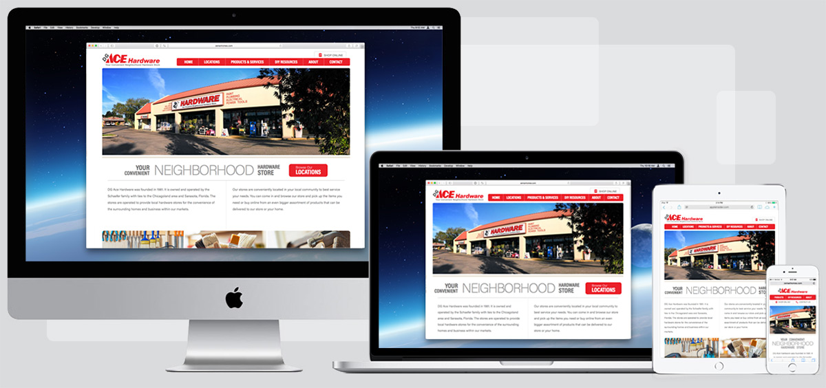
Naturally, rendering a redesign at each pixel would be impossible, so designers use a series of “breakpoints” to indicate lines of demarkation. At GF, we’ll typically split a site into four or five such regions: mobile, tablet, small desktop, large desktop and (occasionally) widescreen displays.
At the larger breakpoints, there’s little in the way of major adjustment: a little tinkering with site-wide font sizes, shrinking large images to avoid pushing important information off the screen, that sort of thing. Valuable adjustments for the legibility of your site, if not grandiose showpieces of engineering. Greater tweaks occur at the tablet and mobile sizes, where screen real estate becomes more valuable. Navigation moves offscreen, usually hidden behind a “menu” link (though I’ve been retaining one or two of the site’s most important links lately, keeping them front-of-mind). Font sizes are adjusted to maintain legibility on the smaller screen, and necessary trims are made to content to avoid looming walls of text. Photography is greatly reduced, with mobile bandwidth limitations to consider. Visual obstructions and decorative elements are cut down to a bare minimum. The site breathes to consume every inch of available space, leaving the largest possible footprint at each screen sizes and/or orientation change. It’s a big shift, but if we’re doing our job right you’ll barely notice the transition.
As with all things online, the state of my industry is in constant flux. What’s gospel today will be garbage tomorrow, as the web continues to thrash and expand in new, unexpected directions. It’s part of what’s always drawn me to the internet; that constant sense of learning, of new discovery. Even if it’s left behind in favor of new technology and terminology, five or ten years down the line, the lessons we learn from responsive web design today will serve to enhance and inform the web’s next phase. For now, they’re a great way to carry your message to a nearly-limitless range of screens. To make everyone feel important and welcome, not an afterthought. And I think that’s pretty cool.